The Branding tab in the website settings brings together everything that affects the visual appearance of your site: navigation bar style, colour palette, favicon and footer. Open the Website module, click Settings, then choose the Branding tab.
Navigation bar style
The first section lets you customize your site’s navigation bar.
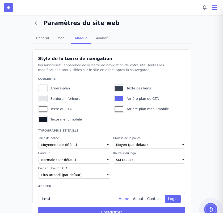
Available colours:
- Background – the background colour of the navbar.
- Bottom border – an optional dividing line below the navigation bar.
- Link text – the colour of the navigation links.
- CTA background – the background colour of the sign-in button.
- CTA text – the text colour of the sign-in button.
- Mobile menu background – the background of the drop-down menu on mobile.
- Mobile menu text – the colour of links in the mobile menu.
Typography and size:
- Font size – small, medium (default) or large.
- Font weight – from light to bold.
- Height – the total height of the navigation bar.
- Logo height – controls the size of your logo in the navigation bar.
- CTA button corners – ranges from square to very rounded.
A live preview at the bottom of the section shows your changes before you save them.
Visual identity and colour palette
The Visual identity section lets you define your favicon and configure six reusable colour palettes for your site.
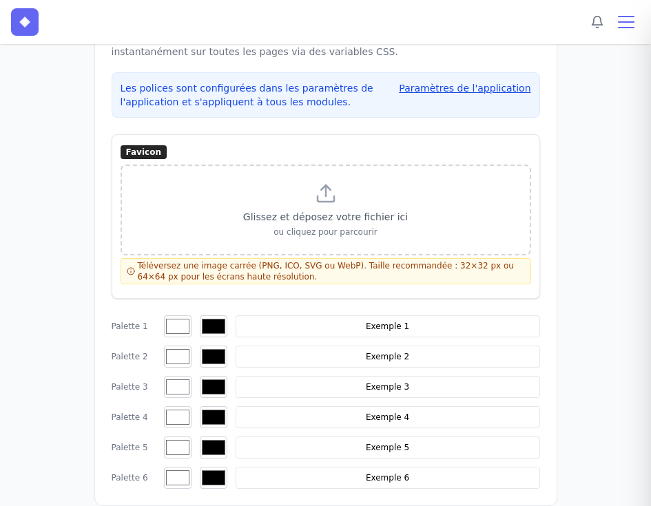
Fonts are configured in Application Settings and apply to all modules. The link takes you there directly.
Favicon: Upload a square image in PNG, ICO, SVG, or WebP format. The recommended size is 32x32 px, or 64x64 px for high-resolution screens. The favicon appears in the browser tab.
Colour palette: Each palette includes a background colour, a text colour, and a custom label to help you identify it, such as “Primary”, “Accent”, or “Light”. These colours use CSS variables and update instantly across your pages.
Palette colours in the page editor
Once defined, your palettes are available directly in each item’s properties panel when editing a page.
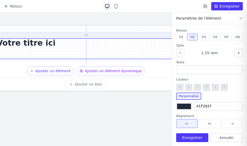
The Colour section displays your six palettes as quick-selection buttons, along with a Custom option for entering any hexadecimal value. This helps you maintain a consistent identity across your pages without memorizing colour codes.
Footer style
The section Footer Style controls the appearance of the bottom of your pages.
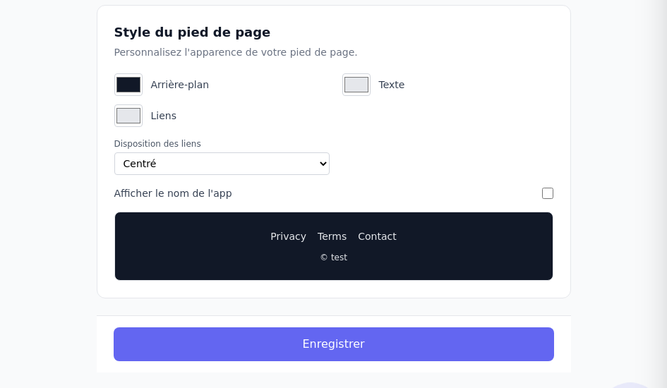
Available options:
- Background – the footer background colour.
- Text – the colour of the copyright text and other information.
- Links – the colour of links in the footer.
- Alignment – centred, left-aligned, or right-aligned.
- Show app name – displays the name of your application in the copyright.
A live preview of the footer appears below the options. Click Save to apply all changes made in the Branding tab.